
English ¦ Deutsch ¦ Português
Dürers Fraktur |
|
|
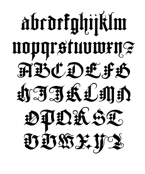
Underweysung der Messung is a pioneering work in scientific illustration; this treaty contains over 150 woodcuts, including outstanding examples of orthographic projection and several of Dürer’s most intriguing designs. It presents a wide range of geometric subjects, with the basics of linear, plane, and solid geometry laying a foundation for applications in architecture and art, including the construction of columns — and the rendering of Roman and Fraktur letterforms. The Underweysung der Messung ends with the artist’s famous analysis of lettering, the earliest attempt to describe typographic design with vectors based on precise numeric values. Though Dürer concentrates on the anlaysis of the Roman capital letters, he does devote a few pages to the rendering and the analysis of Fraktur letterforms. Based on those pages, I digitalised the font presented here. Paulo Heitlinger |
Albrecht Dürer, German painter, engraver and draftsman, is one of the most celebrated artists of the Northern Renaissance. Dürer’s reputation spread throughout Europe during his lifetime, beyond his native city of Nuremberg, a thriving center of trade and culture. Like Leonardo da Vinci, Dürer became deeply involved in scientific and mathematical studies; his application of scientific principles to the creation of art marks the beginning of art theory in Northern Europe and of scientific writing in Germany.
Use this elegant display font for Branding, Advertising and Titlings/headlines. |
|
Buy via Paypal Buy Dürers Fraktur for 39 Euro. |
You may pay online via Paypal , or you may make a Bank transfer. Write a short email to pheitlinger(at)gmail(dot)com and please tell him, how you want to pay. |
 |
|
Dürers FrakturI n the judegement of well-informed scholars, Fraktur is considered a fusion of Textur and Schwabacher letterforms. The characterisitcs of Textur are evident in the minuscules of Fraktur. Schwabacher is a black-letter form that was much used in early German print typefaces. It continued to be used occasionally until the 20th century. Digitalised copy, from the Sächsische Landesbibliothek. Staats- und Universitatsbibliothek Dresden (SLUB): digital.slub-dresden.de/werkansicht/dlf/17139/140/0/ 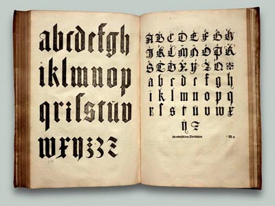
The first Fraktur typeface was designed when Emperor Maximilian I (1493–1519) established a series of books and had a new typeface created specifically for this purpose, designed by Hieronymus Andreae. Fraktur quickly overtook the earlier Schwabacher and Textur typefaces in popularity, and a wide variety of Fraktur fonts were carved. It became common in the German-speaking world and areas under German influence (Scandinavia, the Baltic states, Central Europe). |
|
|
LiteratureAlbert Kapr. Fraktur. Form und Geschichte der gebrochenen Schriften. Hermann Schmidt, Mainz 1993. Bain, Peter and Paul Shaw. Blackletter: Type and National Identity. Princeton Architectural Press: 1998. Silvia Hartmann: Fraktur oder Antiqua. Der Schriftstreit von 1881 bis 1941, Peter Lang, Frankfurt am Main u. a. 1998 (2. üb. A. 1999) |
|