
DE
Deutsch / Português |
|
Peter Behrens Schrift |
|
|
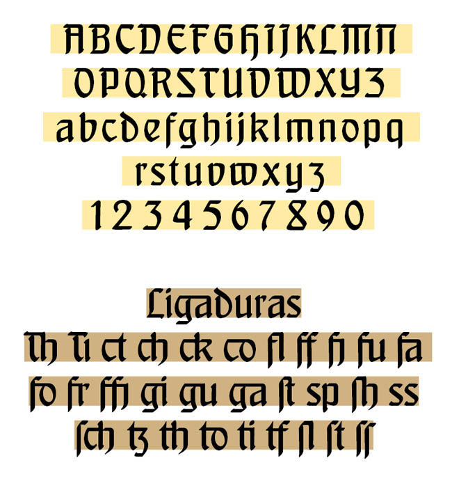
A font which defines a style of the early 20th Century. Inspired in the hybrid alphabet which Peter Behrens developed in 1901/2. His first typeface saw the light in 1901 (having been
developed in 1899), engraved by the Klingspor foundry. |
Specimen, PDF, 1 MB. Opens another window of your browser. |
|
Buy via Paypal Price: 39 Euros. |
|
 |
|
A germanized Roman – or a latinized Fraktur ... |
|
|
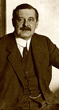
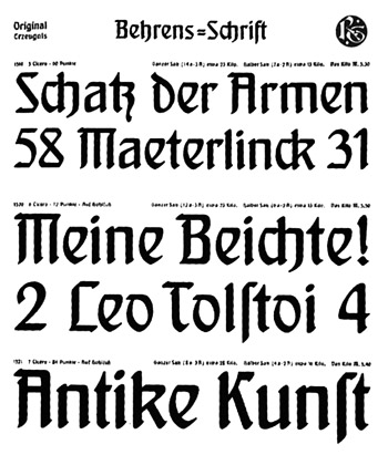
Deeply involved in the debate on art, technique and society, Peter Behrens was convinced that the activity, immediately after architecture, that "supplies the most characteristic image of an era and the strongest testimony of its spiritual progress" was printing. The problem of the printing reform and the design of characters was one of the issues that most involved Behrens at the beginning of the 20th century, his aim being to "find a new type, suited to contemporary sensations and style", characterised by "simplicity and legibility", because, to use his words "we need a character with a serious style for serious books: only then will we be able to transfer this lofty style into everyday life". In Von der Entwicklung der Schrift, the note presenting the specimen, Behrens warns that "a new character can only be developed organically and almost imperceptibly from tradition, only in harmony with the new spiritual and material concepts of the present age". In 1903, Behrens moved to Düsseldorf, to direct the school of applied arts, where he held a course on the design of letters three times (repeated later in Berlin in 1909), aided by Fritz Ehmcke and Anna Simons (student of the 20th century’s greatest calligrapher, Edward Johnston, who Behrens tried to engage as a teacher) and then in 1909, also with Anna Simons, Behrens traced the inscription Dem Deutschen Volk, positioned on the Reichstag by Paul Wallot only in 1917, after much discussion. Behrens second typeface, the elegant and fluid Behrens Kursiv (narrow and bold relation of the Schrift) was produced by Klingspor in 1906-07. 1907, the year in which the Werkbund was formed, is a fundamental date in Behrens’ career, as Emil Rathenau appointed him artistic director of Aeg, for which he designed the character Behrens Antiqua (1908), produced by Klingspor, initially used exclusively by AEG: inspired by ancient classical proportions, with monumental afflatus and uncial variations. Behrens’ last typeface produced by Klingspor, the Behrens Mediäval, saw the light in 1914 (the same year as the exhibition of the Werkbund in Cologne, for which Behrens also designed a splendid Plakat): conceived in 1906-07 and elaborated in 1909-13, is a character of renaissance inspiration, with certain idiosyncrasies in the terminations. |
 |