 Fenice
» Brasil ¦ » Portugal» Espanha
|
E-BOOKS |
| LAYOUT, o e-book que ensina a paginar |
| Alfabetos, o e-book que descreve toda a Tipografia e Caligrafia |
| Tipos e fontes, o e-book que ensina Typeface Design |
| Design em Portugal documenta os primeiros cem anos: de 1870 a 1970. |
| Revistas para Clientes, o e-book sobre o Corporate Publishing |
| Megalitismo, o e-book sobre a Pé-Historia |
| Romanos na Península Ibérica, o e-book sobre a Cultura Romana |
Hermann Zapf
Typeface designer e calígrafo alemão
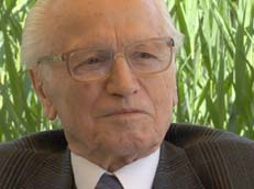
Zapf foi o criador de uma série de fontes conhecidas mundialmente, como as famílias Optima, Palatino, Michelangelo e Sistina.
Contudo, a criatividade de Zapf não é propriamente brilhante; muitas das suas fontes têm um aspecto algo torpe e ultrapassado.
As suas melhores criações são as letras de inspiração caligráfica — como a Zapfino, por exemplo.
Optima
Optima é uma família de fontes sem-serifa desenhadas por Hermann Zapf entre 1952 e 1955.
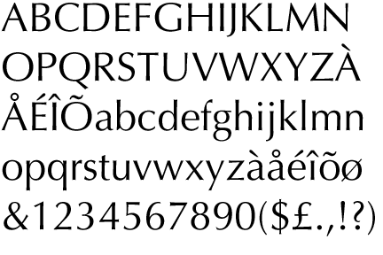 |
| Optima |
Em 2002, Hermann Zapf, em colaboração com Akira Kobayashi, director de arte na Linotype GmbH, redesenhou e criou a variante Optima Nova.
Esta nova família de fontes apresenta a fonte no estilo itálico, autêntico (ao contrário da original); assim como uma série de fontes condensadas, e a Optima Nova Titling com ligaduras.
Esta fonte é comercializada com outros nomes por outras empresas. A Bitstream comercializa com o nome de Zapf Humanist; a WSI Fonts com o nome de Optane; a Rubicon com o nome de Opulent; CG Omega; Eterna.
Manuale Typographycum
Pequena obra de Herman Zapf, o Manuale Typographicum é um exercício e, claro, um manual de utilização de tipos e layouts.
Com as três cores nobres da tipografia e o mero uso de caixas, formas e tamanhos, somos apresentados à história e às inúmeras possibilidades e sentidos que a arte tipográfica permite. Não é propriamente um livro para ser lido, mas sim um recurso, uma fonte e uma ferramenta visual para todos que trabalham ou que se interessam pela tipografia.
O Manuale é uma homenagem à cultura ocidental, na medida em que recorre a inúmeras línguas e tradições para tentar definir o que é a Tipografia.
Autobiografia, PDF
download.linotype.com/free/howtouse/ZapfBiography.pdf
Zapf sobre Rudolf Koch
Because of the political circumstances in Germany in the Thirties I was unable to study electrical engineering as I had hoped. I was in my teens then, a common time to be depressed, but suddenly everything changed for me when, in 1935, I visited Rudolf Koch’s memorial exhibition in my hometown Nuremberg.
I was so impressed by his work that I decided on my future career to become a calligrapher but unfortunately I had to do it by myself. (Because my father was too politically engaged in Nuremberg before 1933 I was not allowed to attend an art school or technical institute.)
I bought two books: Rudolf Koch’s Das Schreiben als Kunstfertigkeit (Lettering as an Artistic Skill) and Edward Johnston’s Writing and Illuminating, and Lettering, a basic reference on the historic sources and tradition of letterforms. However, after a few years of learning from Koch’s instructions I felt his expressionist style was not the way I wanted to follow.
Although I admired the spirit of the work of Rudolf Koch and his co-workers, it was to Johnston’s teachings that I turned to. His influence was especially strong in my designs for roman and italic alphabets; Koch’s influence appeared in my interpretations of Fraktur letterforms.
In 1938, when I was 19 and now living in Frankfurt, I joined the printing studio of Koch’s son Paul, Werkstatt Haus Zum Fürsteneck. (Rudolf Koch had died in 1934.) I met Koch’s widow Rosa Koch and the daughters Ursula and Lore, both working in the studio’s weaving room.
In addition to the commissions of lettering in Rudolf Koch’s studio, I was also involved with the typography of songbooks, and soon wanted to combine the rules of Koch and Johnston to create more simplified letterforms based on historical models.
I tried to develop a much more disciplined lettering style influenced by the typographic exercises which I did in the studio. The powerful expressionist style of Rudolf Koch was too personal for me and I had no wish to copy it. I had the same objections to the methods of Rudolf von Larisch, another writing master of the early twentieth century.
His main preoccupation was with the uni-stroke letterform used decoratively, with a touch of Viennese Art Nouveau. Rhythm was more important to Larisch than legibility. To me, influenced by typography, the essential basis for any letterform is legibility. Edward Johnston, compared to Larisch and Koch, provided me with the classic method of learning lettering.
All three were great masters – but so totally different in personality and teaching. It was not so easy for me to find a satisfactory combination of Koch and Johnston for my own studies at the Werkstatt as everything there was so dominated by the tradition of Koch. To understand the work and personality to Rudolf Koch we must respect the deep experiences and impressions of the inferno of World War I.
Rudolf Koch was searching, like many other people of the postwar generation in the Twenties, for a new world – a better world. He found this in his religion, others in Germany too often in radical political movements. Koch’s religiosity and religious engagement within his work and his daily life was sincere and honest. But a generation which lost all its illusions and which saw in the war the terrible cruelty of man needed an answer for a new beginning.
We must not forget the situation in Germany at that time. Life was overshadowed by the Treaty of Versailles, which destroyed not only the economy and democracy in Germany, but pushed aside the hope for a better future and fundamental of living. The occupation of the Rhineland by French troops, the runaway inflation of 1922–3, combined with harsh reparations dictated by the Treaty, ruined the country and was the fertile soil for the political turbulence which led so many people to follow the flags of extreme political leaders.
Versailles was poison for the democracy of the young German Republic. Rudolf Koch’s patriotism must be seen in these political and economic conditions. Rudolf Koch was proud to be a German – this has nothing to do with nationalism. It was the same feeling for him as for a Frenchman towards his nation, or Americans have to be a citizen of the United States of America. Koch’s fundamental principle was his absolute faith in Christianity, connected with tolerance towards his Jewish friends.
The best example is his loyalty to and close friendship – even after 30 January 1933 – with Dr. Siegfried Guggenheim, Fritz Kredel and Berthold Wolpe. He was not at all a fanatic or missionary. He showed in his work an impulsive openness of feeling, his heart embedded in his teaching by humour and joyousness. His craftsmanship as a teacher, a father figure inspiring young people, was unique and everywhere gained him respect.
Koch’s spontaneous and impulsive force with which he put his letterforms on paper was the opposite of the planning principles of the Bauhaus and their rigid ideas after the move to Dessau. Their philosophy of design was very dogmatic.
Rudolf Koch must be seen in the cultural life of Germany in the Twenties and in the arts and crafts tradition of William Morris, the man and his work which Koch admired throughout his life. Morris’s fundamental intention to use manual labour, and to reject the machine, was the same. Koch never called himself an artist, but always a simple craftsman.
All this seems to be the opposite of our digital age, of an abstract world of forms and manipulation of forms, of inferior copying of the great heritage of our past by the endless variations provided by today’s computers. Today we may see, in the individual atmosphere in which Rudolf Koch worked, a late representative of a world in which the crafts were executed with devotion and with a personal association to the subject.
Again, a connection with William Morris: daily work to be done as an integrated part of life, not simply as a job to earn money, to earn money quickly.
![]()
Página actualizada em 2014.