tipografos.net: design: designers: behrens
A mais bem informada e completa colecção de documentos sobre design
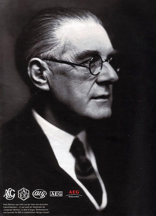
Peter Behrens (1868 — 1940)
Pintor, arquitecto e artista gráfico alemão. É considerado o primeiro designer freelancer. Foi um dos arquitectos mais influentes da Alemanha e um dos fundadores do Werkbund.
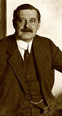
Entre os membros do Deutscher Werkbund destaca-se o nome de Peter Behrens (Hamburgo, 1868 - Berlim, 1940), arquitecto e designer, que mereceu a reputação de ser o primeiro designer industrial e o primeiro a criar uma identidade corporativa.
Entre 1886 e 1889, Peter Behrens estudou na Kunstgewerbeschule em Hamburgo, na Kuntschule em Karlsruhe e na Düsseldorfer Akademie.
Depois de frequentar a Escola de Belas Artes de Hamburgo, partiu para Munique em 1897, durante o período de renascimento das Artes e Ofícios na Alemanha.
A partir de 1890 trabalhou como pintor e artista gráfico em Munique, influenciado pelo Jugendstil. Durante este período produziu gravuras, ilustrações e encadernações no estilo Jugendstil e em 1893 tornou-se membro fundador da Münchner Sezession (Secessão de Munique), um grupo progressista de artistas.
Em 1896 viajou até Itália e um ano mais tarde juntou-se a Hermann Obrist, August Endell, Bruno Paul, Richard Riemerschmid e Bernhard Pankok para montar as Vereinigte Werkstätten für Kunst und Handwerk (Oficinas Unidas) em Munique,
Em 1898 Behrens trabalhou na revista ilustrada Pan e desenhou as primeiras peças de mobiliário, que foram expostas no Glaspalast em Munique no ano seguinte.
Saído das fileiras do Jugendstil, Behrens acabou por acreditar na mensagem de Muthesius.
1907: AEG
Trabalhou para a AEG (Allgemeine Elektricitäts Gesellschaft) no design de aparelhos electro-domésticos. E na comunicação visual e gráfica. Introduziu uma nova expressão para a arquitectura européia com a Fábrica de Turbinas da AEG - primeiro edifício alemão em aço e vidro (1908-1809) — e o complexo de apartamentos para os trabalhadores da AEG, em Henningsdorf (1910-1911).
Na AEG, Behrens fez design em todas as suas dimensões,
- projectou uma moderna fábrica de turbinas (numa tipologia depressa imitada),
- recriou o logótipo e toda a identidade corporativa da empresa,
- encarregou-se da gráfica publicitária e fez design de produto.
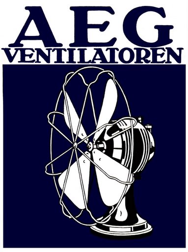
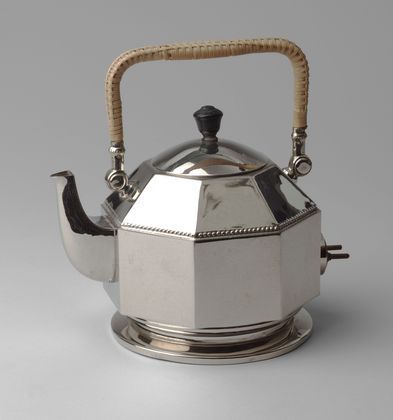
- Produtos tais como ventoinhas eléctricas, chaleiras eléctricas, candeeiros e tantos outros.
 |
|
Chaleira eléctrica. Design de Peter Behrens para a AEG (Allgemeine Elektricitäts Gesellschaft), Berlin, cerca 1909. |
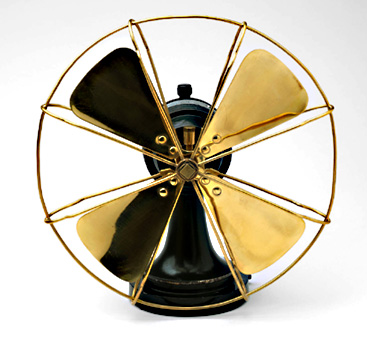 |
| Ventoinha eléctrica |
«Na tecnologia dos produtos eléctricos não se pode mascarar as formas com adições decorativas, porque a tecnologia eléctrica é uma nova área, devemos encontrar formas que representem o novo carácter da tecnologia.»
Em 1899 foi convidado pelo Grão-Duque Ernst Ludwig de Hesse a juntar-se à Colónia de Artistas de Darmstadt (arquitecto J.M. Olbrich, decoradores P. Huber e P. Burck, pintor H. Christiansen, e escultores L. Habitc e R. Bosselt).
Também desenvolveu projectos no estilo neo-clássico,
- nos escritórios em Düsseldorf, da empresa Mannesmann AG (1911-1912),
- na empresa Continental (Pneus de Borracha, 1913-1920)
- na Embaixada Alemã em São Petersburgo (1911-1912).
Foi nomeado director da Escola de Arquitectura de Viena em 1922.
Obras
Fábrica de Turbinas AEG – Berlim, 1910
Casa Behrens – Darmstadt, 1910
Escritórios da IG Farben – Frankfurt, 1920-5
Apartamento na Weissenhofseidlung – Stuttgart, 1926-7
Tipografia
Behrens é conhecido pelo desenho de dois typefaces. Ambos levam o seu nome: Behrens-Schrift e Behrens-Antiqua.
Ligações externas
http://www.flickr.com/photos/nathalle/538225674/
Peter Behrens is best known as an architect from the beginnings of modernism: his AEG Turbine Factory in Berlin is often featured in accounts of modern architecture, and his name is almost always men- tioned in connection with some of his famous apprentices, Walter Gropius, Mies van der Rohe and Le Corbusier.
He is known for his AEG work between 1907 and 1914, in which he successfully co-ordinated all activities from architecture to the design of electrical appliances and publicity material.
Behrens strove to express modernity and the era of mass production in this design programme and his achievements have been hailed as the first instance of 'corporate image'.
This aspect of Behrens's work has been well covered elsewhere and his brand of neo-classical modernism has been hailed as an architectural landmark.
Architecture was Behrens's main vocation, and after the First World War he concentrated almost exclusively on designing buildings.
In the final decade of the nineteenth century, how ever, Behrens was at the forefront of Jugendstil, the German equivalent of Art Nouveau, which led him, like many other artists, into the field of Buchkunst (book art/decoration) and type design.
His design of letterforms illuminates the 'gothic versus roman' dilemma in early twentieth-century Germany, and his typefaces, in particular, illustrate how artistic intentions sometimes obstruct the creation of a suitable style of letterform for reading.
After exhibiting paintings regularly in the 1890s, Behrens followed the lead of Henry van de Velde and Otto Eckmann by renouncing 'fine art': his first designs for jewellery, porcelain, glass and furniture date from 1898-9.
During these years, Behrens was also part of the literary circle associated with the elegant periodical Pan -- Julius Meier- Graefe, Otto Julius Bierbaurn and Richard Dehmel- and these contacts not only led to work in Pan itself but also further commissions for Buchkunst from the individuals.
Behrens's principle task as Buchkünstler was the ornamentation of covers and title pages and, occasionally, he designed a scheme of ornament to run through the text pages.5 Some title pages also bear his lettering, which was usually a shaky attempt at Roman capital forms
Behrens exhibited at several Kunstgewerbe (arts and crafts) exhibitions in 1899, the last being at Darmstadt, which led to an invitation, in the same year, from Grand Duke Ernst Ludwig of Hesse to join the Darmstadt Künstler-Kolonie, which was an idealized attempt to fuse 'life and art.'
This proposition occupied Behrens's thinking at the time and the clearest expression of his theories is carried in his writings concerning a large-scale theatre, including the style of play and staging which would take place in it. He saw theatre as the most complete expression of artistic living, combining drama, music, architecture and imagery in a Gesamtkunstwerk (total work of art).
Feste des Lebens und der Kunst: Eine Betrachtung des Theaters als höchsten Kultursymbols (Celebrations of Life and Art: a consideration of the theatre as the highest symbol of culture) was published in booklet form by Eugen Diederichs in 1900: production was overseen by Behrens and the text was printed in a jobbing style of sanserif type.
This variation on classical centred typography by using the sanserif type was perhaps a typical Jugendstil innovation, yet it was a bold step at the time, as sanserif was a standard display and advertising face but hardly used for book work.
Bibliografia
Bernhard Buderath (Hrsg.): Peter Behrens. Umbautes Licht. Das Verwaltungsgebäude der Höchst AG. München 1990
Deutscher Werkbund u. d. Werkbund-Archiv (Hrsg.): Die Zwanziger Jahre des Deutschen Werkbunds. Giessen 1982
Hans-Joachim Kadatz: Peter Behrens. Architekt – Maler – Grafiker und Formgestalter. Leipzig 1977
Hans-Georg Pfeifer (Hrsg.): Peter Behrens. „Wer aber will sagen, was Schönheit sei?“. Düsseldorf 1990
Georg Krawietz: Peter Behrens im Dritten Reich. Weimar 1995
Alan Windsor: Peter Behrens. Architekt und Designer. Stuttgart 1985
Página actualizada em 1.2011
![]()
Quer usar este texto em qualquer trabalho jornalístico, universitário ou científico? Escreva um email a Paulo Heitlinger.